Luminance
The legibility of a display character is not dependent entirely on contrast, but also depends on luminance, the imprint it makes on the retina, the color, and the background. The luminance of a surface has the unit of lumen per steradian per square meter, or candela per square meter, sometimes termed nit.
The eye's sensitivity for luminance discrimination (DL /L), and therefore for contrast between the segment and the background increases with the increasing luminance level up to about 10 cd/m2, and then becomes flat up to about 103 cd/m2, above which it starts decreasing slightly, see figure below. The curve refers to an observation with white stimuli and with field sizes larger than the rod free area of the eye.
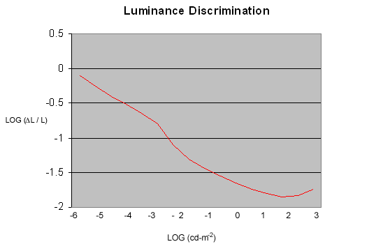
The bend at about L = 5 x 10⁻³ cd/m2 indicates the area below which a change in luminance is made predominantly using parafoveal vision (using rod mechanisms in the eye, which have no color perception), and above which foveal vision (using cones, and high color perception) is predominant. What does this mean?
About 4o away from the optic axis of the eye, the concentration of cones is maximum. This is where the eye has the sharpest vision and is regarded as being on the visual axis of the eye. The ratio of cones to rods varies continuously from all cones and no rods to nearly all rods and very few cones beyond 40o of the visual axis.
Information which must be relayed with more detail must be imaged on the cones, and you must be looking directly at the object. Information which is at a very low intensity can be seen better by the visual periphery and should be viewed by looking to the side.
However, as the relative usage of cones and rods change, the color also changes. As the intensity of a color display decreases, colors drop out sequentially in a predictable order. The first colors to shift to gray are blues and reds, followed by cyan and yellow orange and finally the greens. This differential loss of color perception is called the Purkinje Shift, and is critical to the use of color coding under very low light conditions.
So, as in most display designs, there are trade-off between visual sharpness, low-light viewability, and color perception. The application will determine the type of display to use, the color of the display or type of backlight, and the angle at which the display will be viewed.
I hope this helps with your display designs. As usual, please call us at (440)232-8590 and talk to one of our applications specialists if you have any questions about this or any other product design issues.